
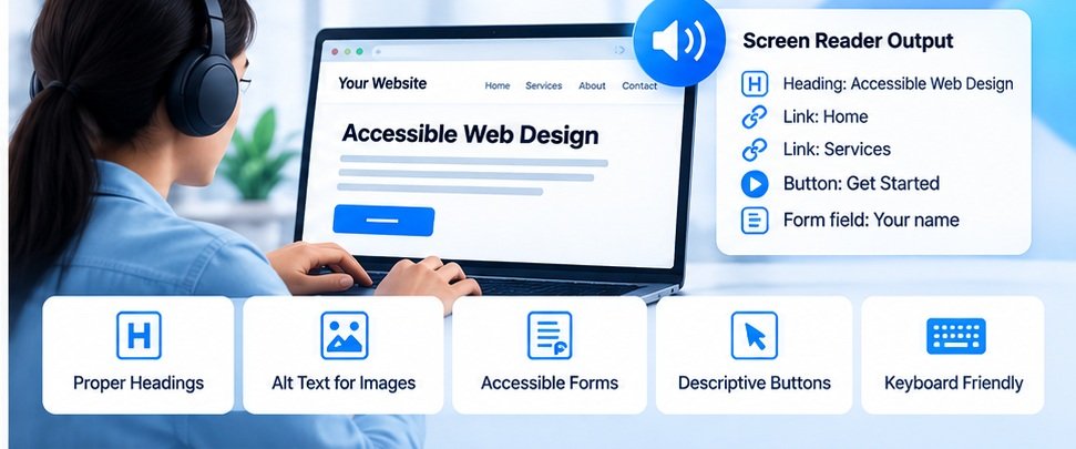
You open your website.
Everything looks normal.
The headings are visible.
The buttons look clear.
The images appear correctly.
The navigation works.
So you might assume the website is accessible.
But visual appearance is only one part of accessibility.
Someone using a screen reader may experience the same website very differently.
What Is a Screen Reader?
A screen reader is assistive technology that reads information from a computer or mobile device and presents it in an alternative way, commonly through speech or Braille output.
People may use screen readers to navigate websites, read articles, complete forms, shop online, and perform many other tasks.
A website therefore needs meaningful structure, not just visual design.
Headings Matter
Imagine an article where every section title is simply styled using bold text.
Visually, it may look fine.
But a screen reader user may rely on the actual heading structure to understand the page.
A well-structured page might use:
H1 for the main page heading.
H2 for major sections.
H3 for subsections.
The exact structure depends on the content, but the important point is that headings should communicate hierarchy.
Images Need Context
Consider a product image.
A sighted visitor can see what it represents.
A screen reader user may depend on alternative text.
A useful alt description should communicate the purpose or relevant information of the image.
But not every image needs a long description.
Decorative images can often be treated differently.
The goal is not to fill every image with keywords.
The goal is to make meaningful content available in an appropriate form.
Buttons Need Clear Names
Imagine a website with a button containing only an icon.
A sighted visitor may understand that the icon means “Search.”
But what does the button communicate to someone using assistive technology?
A meaningful accessible name can make the purpose clear.
The same principle applies to:
- Menu buttons
- Close buttons
- Search buttons
- Delete buttons
- Next/previous controls
A button should communicate what it does.
Forms Are Especially Important
Forms can become difficult for users when fields don’t have clear labels.
Consider a form containing:
“Name”
“Email”
“Phone”
“Message”
The visual design may make the relationship obvious.
But the underlying HTML should also correctly associate labels with their controls.
Error messages matter too.
If a user enters an invalid email address, they should be able to understand what went wrong and how to correct it.
Keyboard Navigation Is Another Simple Test
Put your mouse aside.
Try navigating your website using only the keyboard.
Can you:
- Move through links?
- Open the menu?
- Reach buttons?
- Complete a form?
- Close a popup?
- See where the keyboard focus is?
If you get stuck, a keyboard-only user may have the same problem.
Don’t Add ARIA Everywhere
ARIA can be useful, but adding ARIA attributes everywhere isn’t automatically the solution.
Poorly implemented ARIA can create confusion.
Whenever possible, use appropriate semantic HTML elements.
For example, if something is a button, use a button element rather than creating a generic element and trying to make it behave like one.
Accessibility should begin with good HTML structure.
Accessibility Benefits Everyone
Accessibility isn’t only about users with permanent disabilities.
Consider someone:
- Using a phone in bright sunlight
- Using a temporary injury
- Using a slow connection
- Holding a baby while using a phone
- Using a keyboard because their mouse isn’t available
Good accessibility practices can often improve usability for many people.
Check Your Website
You can use SiteAuditScan to perform an initial review of accessibility-related signals such as alt text, button labels, focus indicators and other checks.
An automated scan is useful for finding technical issues, but accessibility should also involve human testing.
A page can technically pass a particular automated check and still be confusing for a real person.
Final Thoughts
A website isn’t truly easy to use simply because it looks good.
The underlying structure matters.
Headings should make sense.
Images should have appropriate alternatives.
Buttons should have meaningful names.
Forms should have understandable labels.
Keyboard users should be able to navigate.
Accessibility is ultimately about removing unnecessary barriers.
The best question isn’t:
“Does my website look accessible?”
It’s:
“Can different people actually use it?”